A useful device library
19 presets across iPhone, Pixel, Samsung Galaxy, iPad and MacBook sizes. Dimension-source links are built in. Add and save your own custom profiles.
 Viewport LabBY BLAISE
RESPONSIVE TESTING, IN CHROME
See your website through a different screen. A clean, centered preview for phones, tablets and laptops—with room for the browser, too.
Explore the previewChrome extension · Free · Local previews
YOUR PAGE. A NEW PERSPECTIVE.
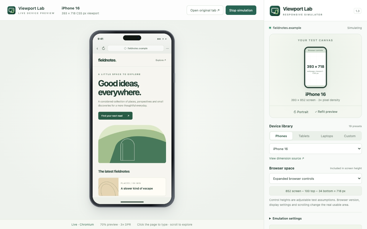
Actual extension previews.
One focused workspace.
PRECISION WITHOUT THE CLUTTER
Switch screens without losing the page you’re testing. Your preview stays connected to the original tab, including its login, cookies and navigation.
19 presets across iPhone, Pixel, Samsung Galaxy, iPad and MacBook sizes. Dimension-source links are built in. Add and save your own custom profiles.
Rotate, adjust pixel density, and reserve space for URL, tab and navigation bars. See screen dimensions and the usable webpage viewport separately.
Use touch-style input or a desktop pointer and keyboard. Check live viewport metrics, then save a PNG at the configured pixel density.
LOCAL BY DESIGN
No extension account, analytics or advertising. Preview frames and input events are processed locally in Chrome. Viewport Lab does not upload page content or screenshots to the developer. Websites still make their own normal network requests.
Read the privacy policyAll presets use Chromium, including Apple devices. This is viewport emulation; it does not run Safari, iOS or Android hardware. Device frames are illustrative, browser bars are adjustable budgets, and final browser-engine, safe-area and performance checks need real devices.
Open an ordinary HTTP or HTTPS website, invoke Viewport Lab, choose a device, and start. Chrome shows a debugging notice during simulation. Stop or Chrome’s Cancel control restores normal browsing. Protected pages and Chrome internal pages cannot be simulated.
QUESTIONS OR FEEDBACK?
menniablaise@gmail.com